Open Data, Geo-Mapping, and Leaflet

I recently had the opportunity to experience the power and potential of open data sources, and thought it was worth sharing.

PhillyCrimeScreenShot

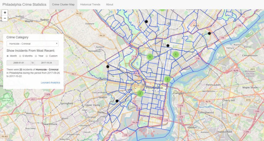
About five years ago I first read about OpenDataPhilly, a portal built by Philadelphia company Azavea to encourage the sharing and creative use of publicly-available information sources. The site hosts over 300 datasets as well as applications and APIs related to the Philadelphia region. When I started playing with the Leaflet Javascript library, which can be used to build web pages with dynamic geo-mapping, I immediately thought about applying it to one of the OpenDataPhilly data sources: the Philadelphia Crime Incident database. It includes details of every reported crime incident in Philadelphia since 2006, including geo-coordinates that can be overlaid on a map.

So I put together this application that lets you explore crime incidents and historical trends for 33 different crime categories. The Crime Cluster Map uses the Leaflet library to show the location of crime incidents during a specified time period; you can zoom in or pan out and it automatically clusters incidents to give you a sense of where the most crimes took place. On the backend, the app is using a web-based API to query the database. If you click on a black circle representing a single crime incident, you will get a pop-up with a few details, including a link to a Google search for more information about the incident (it’s hit-or-miss; you’re more likely to find a relevant news story for a major crime). I also took advantage of another data source provided by Azavea which enabled me to include an overlay of Philadelphia neighborhood boundaries.

The Historical Trends tab shows the number of incidents each year by category; the good news is that crime has been trending down in just about every category since 2006. One thing to note: the fetching of data via the API can be a bit slow at times, especially for the historical trends tab.

I have all kinds of ideas for enhancing this app, but I may just stop here; it turns out there are a number of sites that are taking advantage of this same data to deliver high-quality information, most notably the Philadelphia Inquirer. Nonetheless, my little journey has been instructive and eye-opening.

Do you have any thoughts about how to take advantage of public data sources to develop compelling applications? Feel free to share.

— dml


Optimizing In-Season Allocations

Update 2017-10-16

At the request of 4R, I have removed the shiny application referenced in this blog post. I will be posting another application shortly that illustrates the power of the shiny platform in other respects – stay tuned! 

A picture is worth a thousand words

I was recently talking to a client about the challenges of allocating the right amount of goods to a store from a distribution center when you have a limited number of weeks left before the end of the season. We talked about the factors involved: item demand, length of the next coverage period, time remaining in the season, variability of demand for the item, item margin, etc. As I tried to explain how all of these factors interact to affect the optimal allocation, I recalled that when I worked at 4R Systems, the analytics team created a simple “optimizer” in Excel to illustrate what happens when these various parameters change. I decided to create my own version as a shiny application that I could easily share with my client; you can go here to try it out…let me know what you think. What follows are a few quick notes about the tool and how I built it.

About the Seasonal Inventory Optimizer

A fundamental element of determining how many units you should have in a store right now is to recognize that, even though you know what sells on average, there is a certain probability that you will sell more or less than that in any given period of time. InSeasonalInventoryOptimizer order to model that, we use a little probability theory to estimate the likelihood of selling a given number of units during the next coverage period, and over the remainder of the season. Then we can estimate the expected lost sales that will occur over the next coverage period at a given stocking level, as well as the expected obsolescence cost at the end of the season due to unsold units. If you add together those values (lost sales + obsolescence cost) for each level of allocation, then the optimal stocking level is the one with the lowest total cost. I made a few simplifying assumptions for the purposes of this demonstration tool: demand rate is constant over the remainder of the season, and if a unit is not sold by the end of the season, you lose its entire value (i.e., obsolescence cost = 100% of the unit’s cost).

This tool is great for understanding the dynamics of the process, but if you want to put this idea into practice for your business, you’ll need an industrial-strength version that integrates with your allocation system and takes into account more factors. Surprisingly, not too many commercially-available solutions exist that truly optimize the allocation process, but take a look at 4R’s solution, which profit-optimizes your allocations while taking into account all of the necessary factors.

About Shiny Apps

I do a lot of programming in R, which is an open-source language that is popular among data scientists. An organization called RStudio has been a major proponent of the R language and ecosystem; they created the RStudio IDE, and in 2015 launched a web service that hosts applications written in R using a package called “shiny”. As it says in the help page for shiny, it “Makes it incredibly easy to build interactive web applications with R. Automatic “reactive” binding between inputs and outputs and extensive prebuilt widgets make it possible to build beautiful, responsive, and powerful applications with minimal effort.” And it certainly does – I was able to put this application together in record time without having to fidget with html or style sheets. Shiny is a great way to prototype any visual application. If you want to learn more, just leave me a comment.

dml

The Accidental Retailer

I didn’t start out in retail…

shutterstock_94069645…on the contrary, I studied computer science in college, and worked for businesses doing computer engineering, electronic mail, and interactive television. But then I was offered a position managing technology for a provider of inventory management solutions for retailers. I knew next to nothing about retail at the time, but I worked with some very smart people who patiently educated me, and I got to listen to, and work with, experienced retailers as we developed world-class supply chain solutions. In the process, I discovered a passion for analyzing, articulating, and solving retailers’ business challenges.

Those who have worked with me can tell you that I operate by a few simple guiding principles:

  • Think big, but start small: in the spirit of the agile movement, test your approach to solving the problem by finding the quickest first step that can show positive results. Use that to build confidence and do course corrections.
  • It is difficult to improve what you don’t measure: one of the first things I do on any project is identify the metrics that will be used to determine success; then I measure those metrics to establish a baseline for improvement.
  • Be transparent: never ask your client to take your word for it; whatever analysis you do must be reproducible by them (using the code, data, and instructions you provide).
  • Offer beautiful evidence: we absorb information better when it is skillfully arranged to engage us on multiple levels: visually, verbally, and quantitatively.

So here I am, the accidental retailer, ready to tackle your inventory and supply chain puzzles. Let’s get started.

Dave Leonard, Chief Analyst